
In this article:
- Review of Jira way to handle forms.
- Creating your own active form fields using the React library.
We are all used to the fact that if there is a form on the site, it consists of several form fields and a button that will send data to the server. This is a standard functionality that everyone is used to and that everyone actively uses in their development. How about breaking such a form into several smaller forms that will contain only one field for ease of editing data for the user?
Consideration of analogues with similar functionality. Creating form like in Jira.
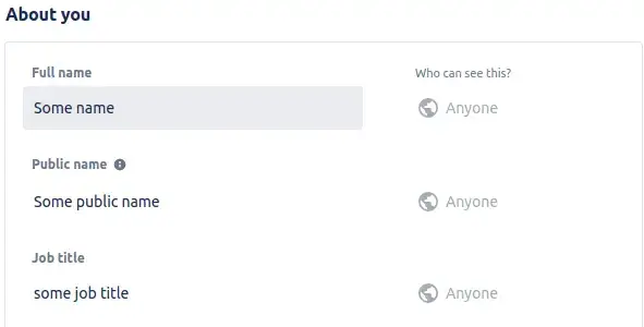
Would like to consider and show which "active" fields will be discussed in this article. For example, you can take the site jira.com. On the detailed page of the user, there are such fields as full name, public name, job title, organization and others. The data fields are organized in a good way, each of the fields can be edited independently of the others, and the data will be sent to the server immediately after any data is entered in the field, and the field loses focus, or the user confirms the sending. This functionality is shown in the screenshot below:
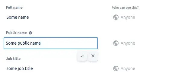
It is also worth noting that two buttons have been added to the functionality of such fields. One of which will serve the user to send data to the server. The other one should not send data, and when clicking on it, the user should return the value of the field that was before manipulations with it. It is also worth noting that when the field loses focus, the "submit" event will fire and the data will be sent. Also, an important factor is that when the user enters the site, he cannot immediately understand that this is not just plain text, but a form field that can be edited, therefore, during development, it is necessary to make a function that will notify the user about editing of this field. For example, add styles for the field that will create a background in the hover event for this block. Here's how it's implemented on jira:
After reviewing a required approach, you can start creating a similar functionality.
Creating your own formwith ability to change asingle field with React.
You need to start by creating html markup. To do this, you should create several form fields, with ready-made functionality for buttons to cancel editing, and confirmation of field editing, which in the future we will show only when the field has focus:
<form>
    <div className="form-group">
        <label>Full name</label>

        <div className="input-wrapper">
            <input type="text" />
            <div className="active-fields-wrapper">
                <button type="submit">
                    <Icon icon={faCheck} />
                </button>

                <button>
                    <Icon icon={faXmark} />
                </button>
            </div>
        </div>
    </div>
</form>
The next step will be to decorate our buttons, and make the inputs look like normal text, on which a background is added when hovering. These are normal styles, so it does not make sense to dwell on it much, because everyone can style their active fields as they like, here we will only show an example of how it can be done:
.example-form {
    margin-top: 40px;
    display: flex;
    flex-direction: column;

    label {
        margin-right: 12px;
    }

    .form-group {
        display: inline-flex;
        margin-bottom: 12px;
        align-items: center;
    }

    .input-wrapper {
        position: relative;

        input {
            padding: 4px;
            border: none;
            transition: all .3s ease-in-out;

            &:hover {
                background: #d5d5d8;
            }
        }

        .active-fields-wrapper {
            position: absolute;
            right: 5px;
            top: 3px;

            button {
                border: none;

                &:nth-child(1) {
                    margin-right: 4px;
                }
            }
        }
    }
}
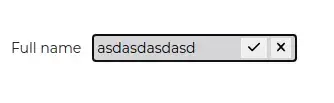
The result of such code can be seen below:
The next step will be to add the functionality needed to display the buttons correctly and submit the form, or reset the data to priority. To do this, we will create a focus variable in the component through the useState hook, which will be responsible for displaying the buttons, and for the form-group tag, we will add an onFocus event handler that will set the flag to true every time the user clicks on our field. Through the onBlur event handler, we will set a flag with the value false every time the field loses focus. We will render the layout of the buttons by checking whether the focus variable is true. An example of such code can be found below:
export default function ExampleActiveField() {
    const [focus, setFocus] = useState(false);

    const handlerBlur = (e) => {
        if (
            !e.nativeEvent.relatedTarget?.classList.contains(
                "active-fields-wrapper"
            )
        ) {
            setFocus(false);
        }
    };

    return (
        <form className="example-form">
            <div
                className="form-group"
                onFocus={() => setFocus(true)}
                onBlur={handlerBlur}
            >
                <label>Full name</label>
                <div className="input-wrapper">
                    <input type="text" />
                    {focus && (
                        <div className="active-fields-wrapper">
                            <button
                                type="submit"
                                className="active-field-button"
                            >
                                <Icon icon={faCheck} />
                            </button>
                            <button>
                                <Icon icon={faXmark} />
                            </button>
                        </div>
                    )}
                </div>
            </div>
        </form>
    );
}
And the last step will be to add functionality for recording the data that the user will enter into our inputs. For this, you need to create a data change through the useState hook, which will store the form data and send it to the server depending on how you need to do it. An event handler should be attached to the input, which will write data to our data variable in the required format. For example, it is selected in the object format, where the key is the name of the field, and the value is the value of this field, respectively. The complete code of the component can be found below:
export default function ExampleActiveField() {
    const [focus, setFocus] = useState(false);
    const [data, setData] = useState("");

    const handlerBlur = (e) => {
        if (
            !e.nativeEvent.relatedTarget?.classList.contains(
                "active-fields-wrapper"
            )
        ) {
            setFocus(false);
        }
    };

    const handlerInputChange = (e) => {
        setData({ [e.target.name]: e.target.value });
    };

    return (
        <form className="example-form">
            <div
                className="form-group"
                onFocus={() => setFocus(true)}
                onBlur={handlerBlur}
            >
                <label>Full name</label>
                <div className="input-wrapper">
                    <input
                        type="text"
                        name="full_name"
                        onChange={handlerInputChange}
                    />
                    {focus && (
                        <div className="active-fields-wrapper">
                            <button
                                type="submit"
                                className="active-field-button"
                            >
                                <Icon icon={faCheck} />
                            </button>
                            <button>
                                <Icon icon={faXmark} />
                            </button>
                        </div>
                    )}
                </div>
            </div>
        </form>
    );
}
This article showed the minimum functionality required to create active fields. It is worth understanding that you can add or change various features yourself depending on the needs of the project.